
Responsive Website Design Creates a Great User Experience
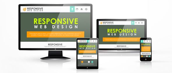
A lot of gadgets abound these days. Cellphones, tablets, desktops, and various other connectivity gizmos make it easy for an ordinary person to gain access to the World Wide Web.
What this means to every business is creating a versatile page with a responsive website design that makes pages available for a variety of gadgets. A responsive web page gets you closer to your intended visitors and provides a good opportunity to rank closer to the top of search engines. It is an effective way to find visibility amongst other websites providing the same nature as your business.
Create a Great User Experience by Developing a Responsive Webpage
One of the primary considerations for developing a website is to create a good user experience for your visitors. Nowadays, when you think of a website, it can conform to whatever connectivity gadget you are using. But there are also websites that can be unnerving because browsing can be extremely difficult.
You would not want your website to be on the list of the latter because it creates a negative experience. Developing a website optimized for mobile devices and other screen sizes is a crucial element to help your website stay on the lead.
Mobile website development is practically essential to be at pace with the endless creation of new devices with different resolution capacities. It is, therefore, necessary to for your business to stay updated with these changes or lose getting websites because of your website’s inability to adapt to a device platform or orientation.
Flexibility is Everything When It Comes to an Effective Website Development
Technological advances have allowed us to manipulate things, which matter most for our daily living. The creation of devices whether it be a computer screen or a mobile device has also made it complicated for website developers to create a web design that conforms to the orientation and size of the screen.
Back in the days when website development was still in its infancy, screen customization and orientation were a big problem. These days though, most websites can adjust to the size of your device screen. This is why your website has to be developed to meet the flexibility requirements of every device.
A website that can switch from a portrait position using a tablet or shift to a larger computer screen creates the flexibility you need to keep the website’s top search engine ranking.
A responsive web design is a must for every online page not only to provide a great user experience but to provide the flexibility and fluidity needed to support your sites optimization and search engine ranking.


