
The Goal of Responsive Website Design
The expectations that people have when they visit a website have changed over the years. People expect more from websites than ever before. They expect the websites to have exciting graphics, to be easy to navigate, easy to find what is needed and they expect them to be safe and secure. It is no longer enough to turn to a template to create a basic website and expect it to attract the audience that is desired. People who own websites for themselves or for a business need to make them responsive. Not everyone is familiar with what responsive website design is or what it can accomplish.
The Changing World of Websites
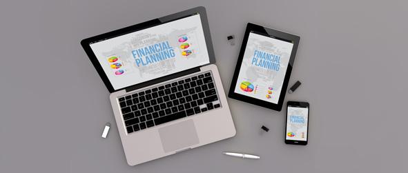
Before a person creates a website, they have to realize the many different ways that it will be visited. When the internet was first being utilized, people accessed it from a desktop computer sitting at a desk in their home or business. Laptops made it possible for people to access the sites from different locations, but the laptops worked in a similar way to the desktops. Mobile devices have changed the way that people surf and view websites on the internet. The screen sizes, resolution and ability of the mobile devices can vary and a good website will be able to handle the variety of devices trying to get to it. The way to do that is through responsive website design.
A responsive website is able to change dynamically the way it appears and works depending on what type of device is accessing it. Responsive website development can make a website easier to see and thus attract more visitors.
The Changing Look of Websites
When people design a website, they may put different things in different places. They can create a few columns to keep the website looking organized and make it easier to view. If a device using a smaller screen tries to access the website, it may not be able to view the website in the right way. It may not be big enough to see all three columns or it may cut off images.
Responsive website development allows the website to change the way it appears when the screen size viewing it is different from the normal devices. It can move things around so the viewer is able to see the website and so that the website still has an appearance this is easy to use, navigate and find what is needed. It makes the website effective for everyone that visits it and can make the website more successful.


